#Dreamlike floral composition
Explore tagged Tumblr posts
Text
🌌 Step into the World of Surreal Beauty! 🌺✨
Introducing my latest artwork, "Ethereal Bloom" – where nature meets fantasy in a breathtaking dance of elegance and mystery. 🌿 This stunning composition showcases delicate white and red flowers intertwined with twisting organic roots, set against a dark, moody background that draws you into another realm.
Perfect for: 🌟 Art lovers seeking unique pieces 🌟 Interior decorators adding a touch of surreal elegance 🌟 Nature and fantasy enthusiasts
This piece isn't just art – it's an experience, a conversation starter, and a statement of bold creativity. Whether it graces your living room, bedroom, or workspace, "Ethereal Bloom" will captivate every soul that lays eyes on it.
✨ Available Now – Limited Edition! ✨ Don’t miss your chance to own this enchanting masterpiece. 🖼️
👉 Click the link to bring "Ethereal Bloom" into your home today! Or DM me for custom sizes and inquiries. 💌
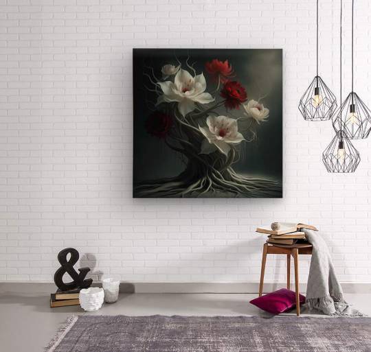
💖 Transform your space into a world of surreal beauty – order now! 💖
#surreal animation#dance of color and light#wonders of the world#unreal places#unreal places - the most unbelievable wonders of planet earth#surreal fantasy#fantasy animation#surreal nature#surreal places#ethereal atmosphere#fantasy flowers#ethereal flowers#nature#beauty of nature#sounds of nature#surreal beauty#fantasy visuals#interplay of light and life#nature relaxation#fantasy#nature documentary#lavender fields of france#future of art#Dreamlike floral composition#Fantasy-inspired flower art#Nature meets fantasy illustration#Hauntingly beautiful wall art
1 note
·
View note
Text
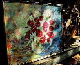
From Old style - poppies with lilac
oil on canvas, 40x50 cm , 2008
500€ in private collection
What is saying AI about this art style in my painting 🎨
Impressionism - Floral Impressionist Painting
This painting belongs to the Impressionism art style, particularly in the Floral Impressionist sub-style. It falls under the Fine Art category, specifically Oil or Acrylic Painting.
The artwork exhibits loose, expressive brushstrokes and a focus on color, light, and movement rather than precise details. The floral arrangement, with bold red flowers, blends into an abstract background, giving it a dreamlike and spontaneous feel.
Elements of the Impressionism Style
Loose and expressive brushstrokes
Focus on light and atmosphere
Vivid, often bright colors
Blending of subject with background
Visible texture and layered paint application
Emphasis on perception rather than realism
Existing Elements in Your Art
Bold and textured brushwork
Soft blending of colors with a glowing effect
A floral subject with a dynamic, fluid background
Strong contrast between warm and cool tones
Imprecise yet expressive composition
Summary Table
AspectDetailsArt Style Impressionism
Sub-style Floral Impressionist
Category Fine Art
Subcategory Oil Painting
Key Features Loose brushstrokes, focus on light, vivid colors
3 notes
·
View notes
Text
Ghost Blossom Drift
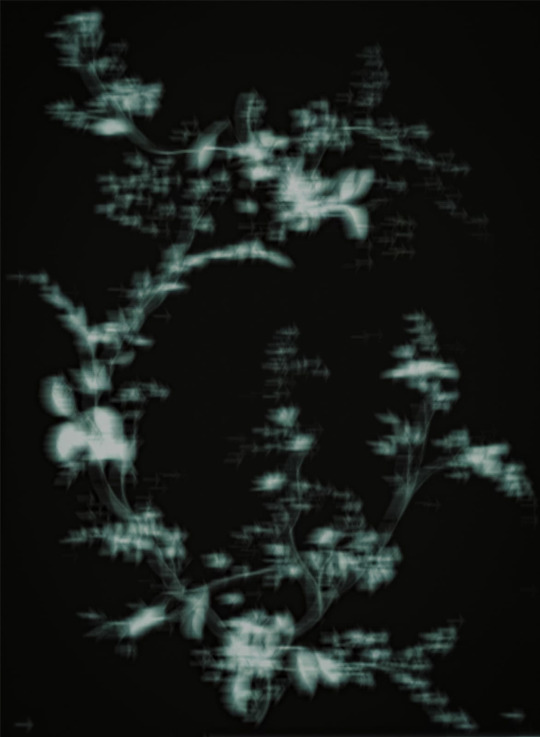
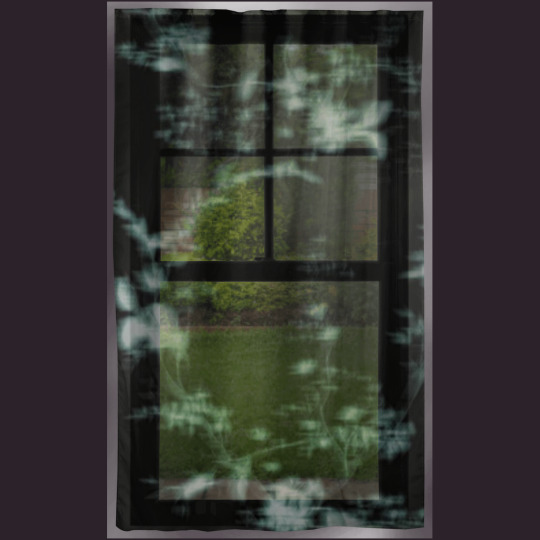
A soft cascade of spectral blossoms drifts across a midnight backdrop in this ethereal floral composition. Blurring the boundary between organic and dreamlike, the image evokes movement, mystery, and delicate melancholy. Perfect for those who appreciate moody minimalism, abstract botany, or a touch of the surreal in their space. Ideal as wall art, apparel, or stationary, this design brings a calming, otherworldly atmosphere to everyday objects.
#ghost flowers#ethereal floral#dark botanical#surreal nature#blurry blossoms#dreamlike art#moody aesthetic#minimalist floral#twilight garden#phantom plants#abstract bloom#misty petals#contemporary nature#nocturnal design#soft focus floral#curtains
2 notes
·
View notes
Text
Apology Letter Regarding Version 1.5 Gaming Experience
Dear Stylists,
First and foremost, we would like to extend our sincerest apologies. We are truly sorry that we were unable to provide you with a stable experience upon the release of the new version. We understand that every stylist's love and trust in Infinity Nikki is something we must cherish and uphold with the utmost dedication.
With the desire to offer Nikki and all of you a more vibrant and colorful journey, we had planned various new content for this update—designing outfits in diverse styles, creating fun and engaging gameplay, and crafting unique landscapes. We hoped Nikki could embark on thrilling adventures across parallel worlds, discovering endless surprises and joy in Miraland.
However, this time, we fell short of expectations. Following the version update, we received a lot of feedback regarding game experience issues, primarily concerning the DIY Workshop, co-op feature, and overall game performance, including issues such as login failures, crashes, and resolution problems. We have been carefully collecting each report and immediately working with our teams to address these issues.
We sincerely apologize for the issues that disrupted Nikki's dazzling and dreamlike journey. Following an urgent review by the development team, we have already resolved nearly one hundred issues, improved the stability of multiplayer servers, and carried out emergency fixes for certain visual display issues. Moving forward, we will continue to monitor the game's performance to ensure these problems do not reoccur.
⸻ 🌱 ISSUES THAT HAVE BEEN RESOLVED
Fixed an issue where, under certain circumstances, the client displayed "Initialization failed, please restart the game" and prevented login.
Fixed an issue where shared outfits were wrongly displayed as Nikki's default outfit [Perfect Start] in the [Color Lookbook].
the piece [Floral Dreamscape] of the outfit [Flowing Colors] had an incorrect category after glow-up.
Fixed an issue where interactions in the Heart of Infinity interface were unavailable under certain conditions.
⸻ 🌱 UPCOMING FIXES AND OPTIMIZATIONS
Resolution setting issues.
Material and lighting display issues in areas such as Sea of Stars, Serenity Island, and Land with No Name.
Interaction smoothness and interruption issues across mobile, PC, and PS5 platforms.
Frequent startup errors on the PS5 platform.
Issues that may block stylists during quest progression, such as abnormal black screens that may occur during cutscene playback in the new exclusive quests.
Performance and experience issues in multiplayer gameplay.
Interaction and sharing experience issues in the DIY Workshop and Color Lookbook.
Ongoing optimization of the performance and visual effects of the outfits [Snowy Ballad] and [Crimson Feather].
Abnormal material rendering for the [Bubbly Bath] decoration on specific devices.
⸻ 🌱 ADDITIONAL CLARIFICATIONS BASED ON COMMUNITY FEEDBACK
Number of Pieces in the 5-Star Outfits [Snowy Ballad] and [Crimson Feather]
In Version 1.5, the Bubble Season update introduced multiplayer gameplay to create a richer, more engaging adventure for Nikki and all stylists. This idea also shaped the design direction of the new outfits.
From the early design stage, we intended the 5-star outfits to embody themes of collaboration and companionship, symbolized by the story of the ever-blazing bird sacrificing herself to save the iceborn mermaid. Thus, we introduced dedicated dynamic effects, transformation animations, and unique music compositions for these outfits.
In [Snowy Ballad], we introduced highly dynamic special effects for the pieces and special aurora effects for the hair. The [Crimson Feather] outfit was designed around the core concept of "rebirth," featuring a unique ash form appearance and different transformation effects depending on whether Nikki is in the air or on the ground. In addition, to align with the theme of the new version, we introduced multi-player features in the design of both the decoration item and dance move.
The [Eternal Snowdew] decoration now features a special co-op interaction, and for the [Everlasting Hope] dance move, we attempted to create a co-op dance mode based on the original dance move. Both the versions were developed with dedicated custom music compositions.
To enrich styling combinations, the total number of pieces for these outfits was set at 11. We sincerely apologize for the lack of prior communication regarding this adjustment. Moving forward, we guarantee that the number of pieces in 5-star outfits will not exceed 11, and major changes will be communicated in advance through official channels.
2. Duration Changes for the Mira Crown Pinnacle Contest
To offer a richer and more diverse styling experience, the Mira Crown Pinnacle Contest and the Special Effects are periodically refreshed and updated.
As each version varies in duration, the duration of each Mira Crown Pinnacle Contest has also differed accordingly. We have taken note of the community's discussions regarding the contest's duration. In response, we are planning to end the current contest at 03:59:00 on May 16 (Server Time), with the next contest starting immediately at 04:00:00 on May 16 (Server Time). Starting from the next cycle, the Mira Crown Pinnacle Contest will be held twice a month, starting on the 1st and 16th of each month (Server Time).
3. DIY Workshop Intentions and Future Plans
The original intention behind the DIY Workshop was to provide stylists with greater freedom in outfit design and styling combinations. We have received all of your feedback and are carefully reviewing the current designs to further optimize the DIY Workshop experience. In addition, for fully evolved outfits, we plan to introduce a more advanced dyeing system in the future, offering expanded customization options and richer visual effects. If you have suggestions regarding the DIY Workshop, please feel free to email us at: [email protected]
Every piece of feedback from you is a driving force for us. Your voices guide Infinity Nikki's path forward. In the future, we will conduct thorough reviews, strengthen our QA processes, and approach every update to prevent such issues from happening again.
As an expression of our heartfelt apologies, we will be distributing the following compensation to all players via in-game mail: 10 Revelation Crystal, 10 Resonite Crystal and 1200 Diamond.
Thank you once again for your support and understanding.
Finally, we would like to speak from the heart. Version 1.5 marks a major milestone for Infinity Nikki. In this version, we took a bold step forward—introducing co-op gameplay for the first time. We hope Nikki's journey can now stretch even further across the vast Sea of Stars, where every heart longing for warmth can find connection and companionship.
Every member of our team shares the same deep love for the Nikki IP, and treats your companionship, Nikki's journey can continue to push the boundaries of imagination.
Please give us one more chance—to let Nikki's starlight continue to shine for us all, and to keep the warmth in our hearts forever burning bright.
6 notes
·
View notes
Text
1 note
·
View note
Text
Why Orlando Photographers Love Shooting at Lake Eola
You’ll love shooting at Lake Eola because its iconic Swan Boats add a whimsical, elegant element, perfect for creative compositions. The vibrant skyline creates stunning backdrops, especially during golden hour or at night, while seasonal blooms and festive lights offer dynamic scenery. The location’s easy access, pedestrian-friendly paths, and variety of natural light conditions help you capture diverse, enthralling images—from wildlife to urban reflections. Keep exploring to uncover more of this versatile, picture-perfect spot.
The Iconic Swan Boats: A Whimsical Touch
Nestled gracefully on the shimmering surface of Lake Eola, the iconic swan boats immediately evoke a sense of whimsy and elegance. When you rent swan boats, you're not just gaining a vessel—you’re embracing a charming, movable sculpture that adds a playful yet sophisticated element to your photos.
These boat rentals serve as perfect whimsical photo props, allowing you to incorporate their sleek curves and pristine white finish into dynamic compositions. The gentle glide across the water creates reflections that amplify the scene’s dreamlike quality.
Whether capturing candid moments or orchestrated portraits, the swan boats provide a unique, interactive foreground that elevates your shots. best Orlando photographer Their presence transforms the lake into an enchanting, storybook setting, making your photography truly stand out.
Stunning Urban Skyline Backdrops
As you step back from the playful elegance of swan boats, the surrounding cityscape of Orlando emerges as a striking backdrop that elevates your photos to a new level of sophistication. The skyline’s dynamic outlines create mesmerizing cityscape silhouettes against the sky, offering a dramatic contrast during golden hour or twilight.
At night, the shimmering reflections of skyscrapers dance across Lake Eola’s surface, adding depth and visual interest. The interplay of light and shadow enhances the scene’s complexity, making each shot more compelling.
You can leverage these features by adjusting your aperture for crisp silhouettes or capturing long exposures to emphasize nighttime reflections. This urban backdrop transforms simple portraits into sophisticated compositions that highlight Orlando’s vibrant city life.
Crisp, defined cityscape silhouettes against vibrant skiesDynamic reflections capturing the city’s lively energyPrecise control over exposure to enhance nighttime reflectionsArchitectural details framing the scene’s depth Vibrant Seasonal Colors and Events
Throughout the year, Lake Eola bursts into vibrant life as seasonal colors and local events transform its scenery into a vivid tapestry. During spring, lush seasonal floral displays burst with bright tulips, daffodils, and azaleas, creating photogenic foregrounds against the tranquil lake.
Summer brings lush greenery, with mature trees providing dappled light perfect for capturing reflections.

As fall approaches, the landscape ignites with warm hues—amber, crimson, and gold—highlighted by seasonal floral arrangements that complement the changing leaves.
Winter and holiday festivities further enhance the scene, with twinkling lights, festive decorations, and holiday-themed displays adding a layer of magic.
These dynamic seas
0 notes
Text
Floating Stillness – Floral Wall Art with Sound and Silence
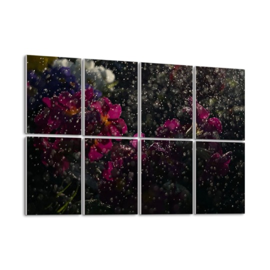
before it even touches the petals. Droplets suspended midair, light caught in the space between bloom and breath.
Rain-Drenched Blooms is a floral composition printed on 8 decorative sound absorbing panels. It’s quiet, but never silent. A design meant for spaces that soften the world around you.
Seven versions shift the tone without losing the stillness:
🎨 Full Color – vivid, rich, tactile ⚫ Black and White – stark, moody, reflective ⚪ Grayscale – restrained and gentle 🌀 Inverted – dreamlike and unexpected 📸 Polaroid – soft focus, nostalgic edges 🟤 Sepia – golden, timeless, grounded 🌈 Technicolor – saturated, expressive, alive
A piece of quiet that listens with you.
🛒 Shop Rain-Drenched Blooms Sound Absorbing Wall Panels
#floralart#acousticpanels#soundabsorbingdecor#softaesthetic#vintagedesign#interiorinspo#petalsandlight#creativeinteriors#quietspaces#dreamywallart#homedecor#officedecor#soundabsorbingpanels#acousticwallart#workspaceinspiration#recordingstudioinspo#therapydesign#calmspaces#decorwithfunction#wallartideas#floralinterior#modernfloraldesign#functionalart#moodydecor#artanddesign#gallerywalls#interioracoustics#naturedecor#decorativepanels
0 notes
Text
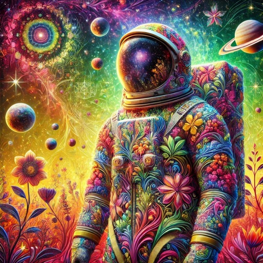
A colorful astronaut wearing a space suit with a floral pattern
DALL-E3 PROMPT: A surreal, colorful image of an astronaut standing in a dreamlike cosmic environment. The astronaut's suit is intricately designed with a mosaic of bright, organic patterns, blending flora and fauna motifs in a psychedelic style. The suit is decorated with abstract plant life, animals, and vivid colors, creating a fusion of nature and space exploration. The astronaut's helmet visor reflects a serene outer space scene with stars, planets, and a nebula in green, orange, and purple hues. The background is a warm yellow, filled with floating celestial bodies, stylized flowers, leaves, and geometric shapes in pink, purple, blue, and red. Cosmic symbols and starbursts are scattered throughout, adding a mystical feel. The astronaut's left hand rests on their chest, suggesting a sense of calm or reverence. The image combines themes of cosmic exploration, nature, and introspection, creating a harmonious, spiritual atmosphere in a surreal and dreamlike composition.
#DALL-E3#astronaut#colorful#AI#AI art#AI art generation#AI artwork#AI generated#AI image#computer art#computer generated
1 note
·
View note
Photo


The planet, classified as XR-328, presents a mesmerizing array of natural wonders, visible even from its orbit. Its atmosphere shimmers with a turquoise hue, indicative of a rich, oxygen-heavy composition, interspersed with swirling white clouds. Spanning across its surface, XR-328 hosts distinct biomes: the Whispering Misty Meadows, the Radiant Crystal Caverns, the Eternal Flame Desert, and the Electric Aurora Peaks. The Whispering Misty Meadows are vast expanses of lush green fields cloaked in a perpetual, soft mist, giving it a dreamlike quality. This biome supports diverse floral species, which contribute to its high oxygen levels. Next, hidden beneath these meadows are the Radiant Crystal Caverns—networks of underground grottos lined with luminescent crystals that illuminate the dark spaces in a spectrum of colors. To the west lies the Eternal Flame Desert, a stark contrast with its relentless, fiery winds and sprawling sands that can reach scorching temperatures, making it appear as though the ground itself is alight. In the northern hemisphere, the Electric Aurora Peaks rise, characterized by sharp cliffs and frequented by spectacular light displays akin to auroras, likely caused by intense magnetic fields interacting with atmospheric particles.
#WhisperingMistyMeadows#RadiantCrystalCaverns#EternalFlameDesert#ElectricAuroraPeaks#GalacticVistas#NebulaWhispers#StellarWonders#CosmicBeauty#CelestialSerenity#AstroPhotography
0 notes
Text
ChuCui Palace and the Contemporary Expression and Aesthetic Reconstruction of French Chinoiserie
In contemporary design, French Chinoiserie has re-emerged as an elegant and distinctive aesthetic, exemplifying cross-cultural artistic fusion. As an 18th-century European romanticized interpretation of Chinese culture, Chinoiserie reflects Western admiration for Chinese artistry while embodying the interplay between Eastern and Western aesthetics. With globalization and growing appreciation for multiculturalism, this exotic style has found new life in modern design.
Chinoiserie’s resurgence in contemporary design is due to its unique aesthetic tension — drawing inspiration from Eastern elements while incorporating Western artistic reinterpretation. It blends traditional Chinese elegance with European aristocratic grandeur, manifesting in fashion, interior décor, and jewelry design. With intricate patterns, symbolic Eastern motifs, and soft color palettes, Chinoiserie offers a refined and romantic lifestyle infused with cultural depth. Unlike traditional Chinese design, which tends toward solemnity and restraint, Chinoiserie emphasizes decorative richness and romanticism, using exaggerated interpretations of Eastern motifs to create a dreamlike and poetic ambiance.
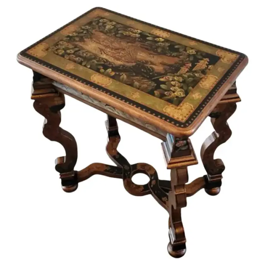
Hand-Painted Ebony Chinoiserie Baroque Console Table,image source from 1stDIBS
A hand-painted ebony console table with gilded Baroque-style bronze detailing, inspired by late 17th- to early 18th-century European Baroque furniture, serves as an example of contemporary antique revival. The X-shaped cross-frame, a design element popular in Louis XIV-era tables, is reimagined with sleek, elegant lines and dramatic flair. The tabletop is adorned with vivid Chinoiserie scenes and intricate floral motifs, while the border features Baroque-inspired scrollwork and gilded edges, demonstrating the fusion of Chinoiserie’s elaborate charm and vintage appeal.
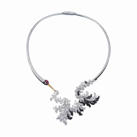
ChuCui Palace’s “Dancing in Clouds” Necklace
The ChuCui Palace jewelry brand epitomizes Chinoiserie in jewelry, notably through the “Dancing in Clouds” necklace, which fuses Chinese ink painting, expressive aesthetics, and Western gem-setting techniques. The design incorporates Rococo-inspired soft curves alongside traditional Chinese artistic restraint.
The necklace features a crane’s elegantly curved neck, an abstract representation of traditional Chinese freehand brushwork. This contemporary interpretation pays homage to Chinese calligraphic expression, aligning with Chinoiserie’s poetic vision. The pure, minimalist color palette reflects the crane’s symbolic purity in Chinese iconography, while the interplay of negative space and delicate contours enhances its visual tension and ink-inspired aesthetics. The composition balances intricate maximalist feather detailing with a minimalist abstract neck, amplifying the piece’s dramatic contrast and rhythmic movement.
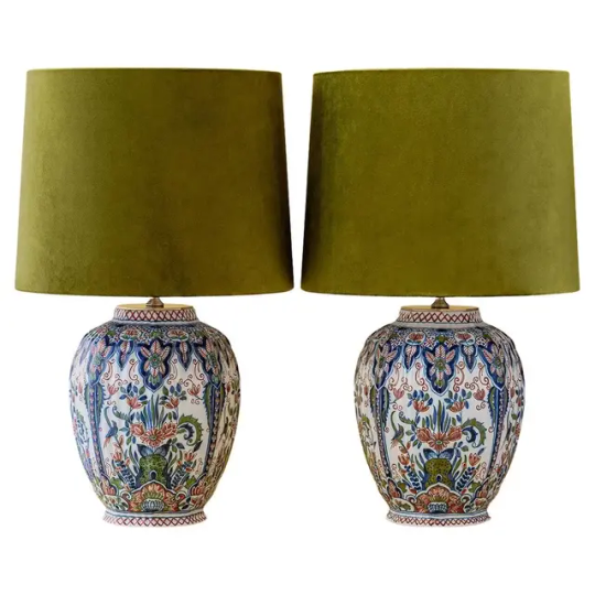
Royal Tichelaar Makkum Delftware Lamps, image source from 1stDIBS
A pair of Royal Tichelaar Makkum Delftware lamps, handcrafted by Amitābha Studio, showcases Chinoiserie’s influence in ceramic design. The lamp bases repurpose hand-painted Delft vases (1940–1979) from the Netherlands’ oldest ceramics manufacturer, Royal Tichelaar Makkum.
The vases’ intricate patterns draw inspiration from traditional Chinese bird-and-flower paintings and porcelain designs. However, unlike conventional Chinese motifs, the composition emphasizes Baroque-inspired symmetry and Chinoiserie’s ornate maximalism. The **rich color palette — blue, green, and red ochre — **honors traditional Chinese blue-and-white porcelain aesthetics while employing Western shading techniques to enhance depth and ornamentation.
The revival of French Chinoiserie in contemporary design is not merely nostalgic but reflects a deeper exploration of cultural fusion in a globalized world. By reinterpreting Eastern elements and merging them with Western artistry, Chinoiserie enriches modern design with cultural heritage and artistic dynamism. Whether in furniture, jewelry, or interior décor, Chinoiserie continues to embody a refined, romantic aesthetic that transcends East-West artistic boundaries.
As cultural awareness and artistic sensibilities evolve, Chinoiserie is poised for continued innovation and reinvention. More than a historical style, it represents a cultural phenomenon, redefining aesthetic narratives by seamlessly blending past and present, East and West. With its timeless elegance and poetic depth, Chinoiserie will continue to shape global design trends, serving as a beacon of cross-cultural artistry and creative synthesis.
0 notes
Text
Radiant Flora Drift On Etsy
Immerse yourself in Radiant Flora Drift—a stunning AI-generated floral composition that blends sophisticated design, metallic accents, and dreamlike hues. 🌺✨ This artwork captures the essence of nature and futuristic beauty, evoking a sense of serenity and wonder.
With its intricate details, vibrant colors, and a mesmerizing balance of light and shadow, this piece is perfect for digital art lovers, collectors, and interior design inspiration. The elegant floral motif, complemented by sleek metallic elements, brings a modern and luxurious aesthetic to any space.
💬 What emotions or inspirations does this piece spark for you? Let us know in the comments!
#black art#black tumblr#ai artwork#ai art community#aiartcommunity#digital painting#ai art generator#ai art#ai#AIArtWurk#FloralElegance#DigitalMasterpiece#GenerativeArt#AIFloralDesign#AestheticVisuals#AbstractFlora#CreativeAI#ArtisticExpression#NextGenArt#FuturisticArt#SurrealDesign#MeditativeArt#ElegantDecor#LuxuryWallArt#DreamlikeScenes#NatureInArt#EtherealBeauty#BotanicalInspiration#ColorfulCreations#AIVisualization
1 note
·
View note
Text
Portals Perfume: Melanie Martinez's Enchanting Fragrance
Melanie Martinez, known for her artistic and creative expressions in music and visuals, has now extended her ingenuity to the world of fragrances. Her latest release, Portals Perfume, captures the essence of her unique persona and offers fans and fragrance enthusiasts alike an opportunity to experience her creativity in a whole new way. This article dives deep into the story, notes, packaging, and artistry behind Portals Perfume, providing a comprehensive guide to this sensational scent.
The Inspiration Behind Portals Perfume
portals parfums draws inspiration from Melanie Martinez's ethereal and dreamlike aesthetic, heavily influenced by her "Portals" album. Each aspect of the fragrance—from its notes to its design—reflects the surreal, otherworldly vibe that has become synonymous with her brand. Melanie envisioned a scent that could transport wearers into a mystical dimension, aligning perfectly with the themes of transformation, growth, and rebirth explored in her music.
The perfume's creation involved collaboration with top perfumers to ensure that the final product embodied Martinez’s vision. Every detail, from the initial concept to the final product, speaks to her dedication to delivering an immersive sensory experience.
A Breakdown of Portals Perfume's Fragrance Notes
The composition of Portals Perfume is as enchanting as its inspiration. The fragrance is a harmonious blend of top, middle, and base notes, designed to create a transformative scent journey. Below is a detailed breakdown:
Top Notes
The initial impression of Portals Perfume is light, fresh, and captivating. Citrusy bergamot, combined with a hint of juicy pear, offers a burst of brightness. These top notes set the stage with an invigorating and approachable opening, inviting you into Melanie's imaginative world.
Middle Notes
As the top notes fade, the fragrance transitions into a heart filled with floral and creamy elements. The delicate essence of jasmine and the soft allure of pink peony come to life, giving the perfume a romantic and dreamy quality. The floral middle notes perfectly embody the ethereal spirit of Martinez's artistry.
Base Notes
The scent journey concludes with a deep and warm base. Sandalwood, vanilla musk, and a touch of ambergris anchor the perfume, adding depth and sophistication. These base notes linger beautifully, ensuring a lasting impression that resonates with wearers.
The Artful Packaging: A Visual Delight
True to melanie martinez perfume commitment to creativity, Portals Perfume's packaging is nothing short of a masterpiece. The bottle itself is a work of art, designed to resemble an otherworldly sculpture. Its iridescent finish and intricate details reflect the surreal themes of the "Portals" album. The soft pastel tones used in the design complement the fragrance's delicate and dreamy vibe.
Additionally, the box features whimsical illustrations that echo Melanie’s signature artistic style. Fans will appreciate how the packaging ties into her broader creative universe, making the perfume a collectible piece of memorabilia.
Why Portals Perfume Stands Out
Portals Perfume is more than just a fragrance—it’s an experience. Unlike traditional celebrity fragrances, which often rely on generic formulas, this perfume feels like an authentic extension of Melanie Martinez's artistry. The careful attention to detail in both the scent composition and packaging sets it apart in a crowded market.
Uniqueness: The fragrance captures a truly distinctive personality, aligning perfectly with Melanie's artistic vision.
Longevity: Thanks to its well-balanced blend of notes, the perfume offers long-lasting wear, making it suitable for both day and evening use.
Versatility: While designed with a dreamlike aesthetic in mind, the fragrance is wearable for various occasions, from casual outings to formal events.
How to Incorporate Portals Perfume into Your Routine
To get the most out of Portals Perfume, consider these tips for application and layering:
Apply to Pulse Points: Spritz the perfume on your wrists, neck, and behind the ears. These areas emit heat, helping to amplify the fragrance.
Layer with Complementary Products: Pair the perfume with unscented or lightly scented moisturizers to ensure the scent lasts longer.
Avoid Rubbing: Gently dab the fragrance instead of rubbing it in, as rubbing can alter the scent profile.
With its versatile composition, Portals Perfume transitions seamlessly from daytime wear to an evening statement, ensuring you smell amazing throughout the day.
Where to Purchase Portals Perfume
Portals Perfume is available exclusively through Melanie Martinez's official website, Portals Perfume Shop. Fans and fragrance lovers can purchase it directly, ensuring they receive an authentic product. The perfume is available in multiple sizes, catering to different preferences and budgets.
For those looking to gift this unique fragrance, the website also offers special gift sets that include additional goodies inspired by Melanie's artistry.
The Verdict: A Fragrance That Captivates
Portals Perfume is a testament to Melanie Martinez's ability to turn her artistic vision into a sensory experience. From its enchanting fragrance notes to its meticulously designed packaging, the perfume embodies the creativity and uniqueness that define her brand. It’s more than just a scent—it’s a statement piece that allows wearers to carry a piece of Melanie's world with them wherever they go.
0 notes
Text
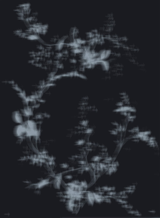
Ghost Blossom Drift
A soft cascade of spectral blossoms drifts across a midnight backdrop in this ethereal floral composition. Blurring the boundary between organic and dreamlike, the image evokes movement, mystery, and delicate melancholy. Perfect for those who appreciate moody minimalism, abstract botany, or a touch of the surreal in their space. Ideal as wall art, apparel, or stationary, this design brings a calming, otherworldly atmosphere to everyday objects.
#ghost flowers#ethereal floral#dark botanical#surreal nature#blurry blossoms#dreamlike art#moody aesthetic#minimalist floral#twilight garden#phantom plants#abstract bloom#misty petals#contemporary nature#nocturnal design#soft focus floral
0 notes
Text
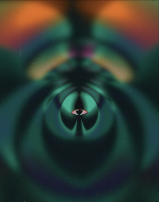
This enchanting image captures a mesmerizing blend of colors and shapes, creating a dreamlike visual experience. At the center, a flower circular shape radiates outward, seamlessly merging with delicate floral patterns that bloom across the canvas. The combination of deep blues, vibrant purples, and bright yellows creates a captivating contrast, evoking a sense of wonder and imagination.
The circular design draws the eye inward, while the flower shapes expand outward, suggesting a feeling of growth and movement. The fluidity of the shapes enhances the artwork’s organic feel, making it seem as if the flowers are gently swaying in a soft breeze.
The blue hues provide a calming backdrop, while the purples add depth and richness, and the pops of yellow inject warmth and energy into the composition. This color palette works harmoniously to create a sense of harmony and balance.
Overall, this artwork invites viewers to explore its layers and appreciate the beauty found in the interplay of shapes and colors, reminiscent of a surreal garden blooming with creativity.
1 note
·
View note
Text
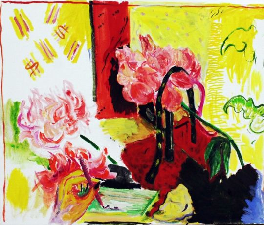
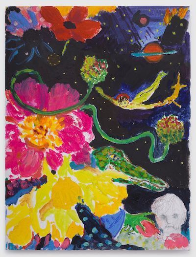
Emily Sundblad, born in 1977 in Dalsjöfors, Sweden, currently resides and creates in New York. She received her BFA from Parsons the New School for Design in New York in 2003, before attending the Whitney Museum's Independent Study Program, which she completed in the spring of 2006. She also works as an artist, performer, curator, and co-founder of Reena Spaulings Fine Art. In her bodies of work, Sundblad weaves together references to advertisements, souvenirs, floral arrangements, and songs. Recent exhibitions of her work have been showcased at prestigious venues such as Galerie Neu in Berlin and House of Gaga in Mexico City.
Description of Sundblad's Work:
Sundblad's creations take viewers into a world where reality and imagination collide, causing an otherworldly feeling. Her compositions defy traditional spatial logic, having viewers explore dreamlike landscapes. One of the most striking aspects of her work is the use of florals, which give her pieces vibrancy and life. Additionally, Sundblad's manipulation of color combinations further enhances the atmosphere of her art, drawing the viewer's attention.
What Interests Me:
Personally, I'm fascinated by Sundblad's ability to create visual narratives that are different from conventional art. Her work challenges viewers to reconsider their perceptions of space and reality, offering a glimpse into an alternate universe. Furthermore, the use of everyday references like advertisements and souvenirs adds layers of complexity to her pieces, prompting reflection on themes such as nostalgia and childhood
Discussion Questions:
Sundblad frequently incorporates references to advertisements, souvenirs, and songs in her work. How does she use these elements to engage with broader societal themes, such as nostalgia or memory?
The use of florals and vivid color combinations is a signature aspect of Sundblad's artistry. How does she use these elements to evoke specific emotions or atmospheres within her pieces?
0 notes
Text
The Best Mood-Boosting Perfumes
A well-chosen fragrance can lift our spirits, boost confidence, and even transport us to different realms. Experimenting with different scents and finding the ones that resonate with you will help you create a fragrance wardrobe that enhances your mood and brings you joy. So go ahead, spritz on your favorite mood-boosting perfume, and let its enchanting aroma uplift your spirits throughout the day.
In this blog post, we will explore some of the best mood-boosting perfumes that will leave you feeling uplifted, refreshed, and ready to take on the world.
331- Costa Amalfi
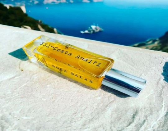
Costa Amalfi opens with a burst of invigorating top notes. The zesty combination of mint, berries, grapefruit, lemon, and basil awakens the senses, like a gentle coastal breeze carrying the scents of wild herbs and citrus orchards. As the fragrance unfolds, the heart notes reveal a captivating composition.
TOP NOTES: Black pepper and coriander add a spicy and aromatic depth, while orange blossom and sage infuse a delicate floral touch.
MIDDLE NOTES: Jasmine and neroli lend a hint of sensuality, like blooming flowers adorning the terraced gardens overlooking the sea.
BASE NOTES: A grounding and lingering presence
332- Dream
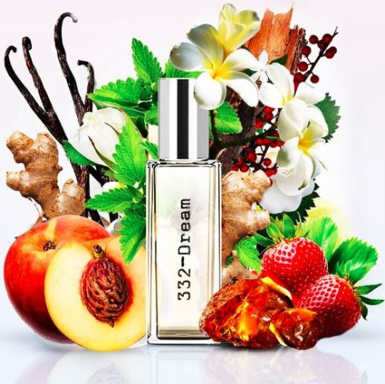
Dream opens with a luscious and indulgent blend of top notes. Caramel, peach, and strawberry combine to create a delectable and sweet introduction, the whimsical delights of a dreamlike confectionery. Ginger and pink pepper intertwine, adding a vibrant and tantalizing kick. TOP NOTES: Geranium and labdanum lend a floral and resinous depth, reminiscent of a hidden garden blooming with secrets. MIDDLE NOTES: Intrigue and mystery, like the enigmatic pathways of a dream.
BASE NOTES: depth and sensuality to the composition.
004- Neroli Blossom
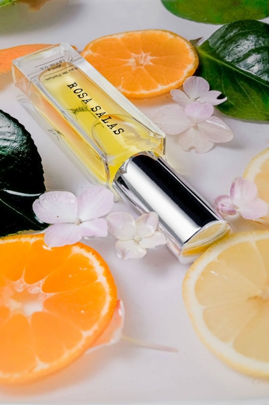
This is a truly wonderful scent, this scent lasts twice as long and costs half as much as most perfumes. Neroli Blossom is the perfect accessory for summer clothing whether it's formal or casual. Neroli is wonderfully balanced with a delightful refreshing citrus floral fragrance reminiscent of colognes of the past. Elements of bergamot, lemon and mandarin zest combine with a herbal whisper. The heart is full blooming Neroli blossoms, lavender sprigs and jasmine upon a gentle musky base forming this mesmerising perfume. This beautifully crafted Neroli scent leaves a lasting impression.
076- Santal Lush
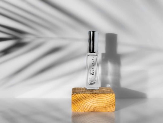
Santal Lush is a textured fusion of smooth creamy sandalwood with exotic eastern spices and aromatic floral, entwined with sumptuous woods to create a soft, naked glamour of fresh earthiness.The opening notes of Santal Lush is the tempting part of the scent with creamy yet fig-fruit richness, which gives you a metallic, dry, with viscous hints of incense and cardamom, iris, lilly and ambergris. Soon after the heart notes come to play with the harmony of firewood, juniper, and Indian sandalwood unfolds softly to transport you to a tropical beach dancing around the bonfire at sundown, giving you a hot loving energy.
074- Amethyst
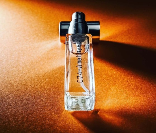
Amethyst is a dynamic yet mysterious fragrance that creates an extremely attractive aura around you. Both in quality and composition, this fragrance offers a step-up for those who want a little sweeter tobacco and niche flair in their blend. It opens with a beautiful cinnamon and honey, sprinkled with pink pepper, the mid notes follow closely behind with an amazing gourmand tobacco, northern Brazil tonka beans and caramel, it ends with a stunning dry down of incense and Ambergris.
Perfumes Making Your Mood Good!
Perfumes have a remarkable ability to influence our moods and emotions. Just a spritz of the right fragrance can transport us to a state of tranquility, confidence, or sheer happiness. With an overwhelming array of perfumes available today, it can be challenging to find the ones that truly uplift and energize our spirits. In this blog, we will explore some of the best mood-boosting perfumes that have the power to enhance your mood and leave a lasting impression.
Have you joined the Rosa Salas Perfumes private member's Facebook group?
Business overview
Passionate about scent and the beautiful impact perfume has on those surrounding you, our fragrances are highly concentrated and long-lasting. Our products are Made in UK and our oils sourced from a leading perfume factory who have over 90 years industry experience and over 20 factories around the globe. As well as providing you with your perfect perfume, we feel it is extremely important to emphasise that we are a vegan, animal and environmentally friendly company.
We follow the Industry guidelines, regulations and promise our customers 100% satisfaction guaranty or full money back. Scent is at the heart of Rosa Salas Perfumes, as we understand the importance and impact perfume can have. Whether you choose a certain perfume to attract and impress by finishing off your outfit with one final spritz, or to remember and reminisce due to our scent sense being closely linked to memory, we offer a selection of different women’s, men’s and unisex fragrances for you to choose from.
Offering an affordable alternative choice to the expensive designer scents which our products are inspired by and providing also our own creations including our Oud Collection All our scents are a higher quality option over the lightly scented products seen on the high street, our aim is to provide you with the ultimate perfume, giving you that endearing feel-good confidence, day and night. The wide range of long-lasting perfumes on sale here at Rosa Salas Perfumes are all guaranteed to leave you smelling and feeling beautiful continuously throughout the day. Regardless of whatever scent you are drawn to, whether that be an energetic citrus, romantic floral, fruity sweet, oriental, spicy or woody, we are the experienced online perfume destination to provide you with your perfect scent to lift your spirit and leave you smelling mighty fine.
0 notes